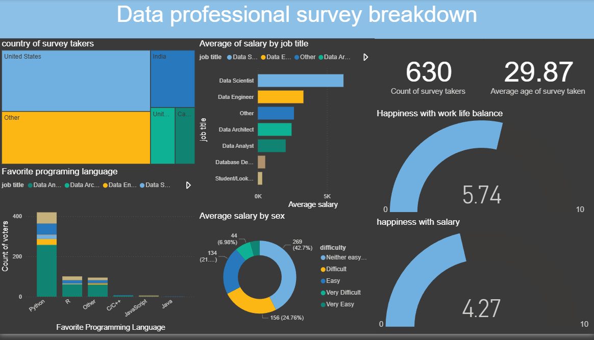
This dashboard visualizes the results of a global survey of 630+ data professionals, revealing patterns in salary, job satisfaction, career transitions, and technical preferences. The goal was to uncover what drives happiness, compensation, and career difficulty in the data field — and to present it in a way that’s both intuitive and actionable.
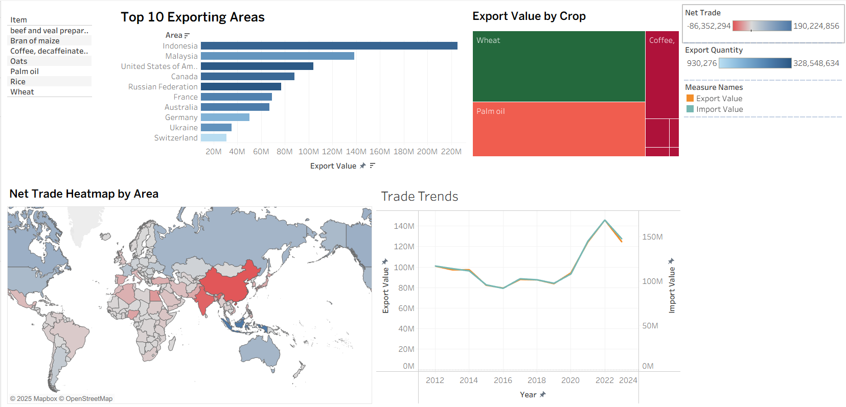
visualize and analyze global trade flows of key agricultural commodities, identifying major exporters, importers, and economic dependencies to derive strategic insights.
.
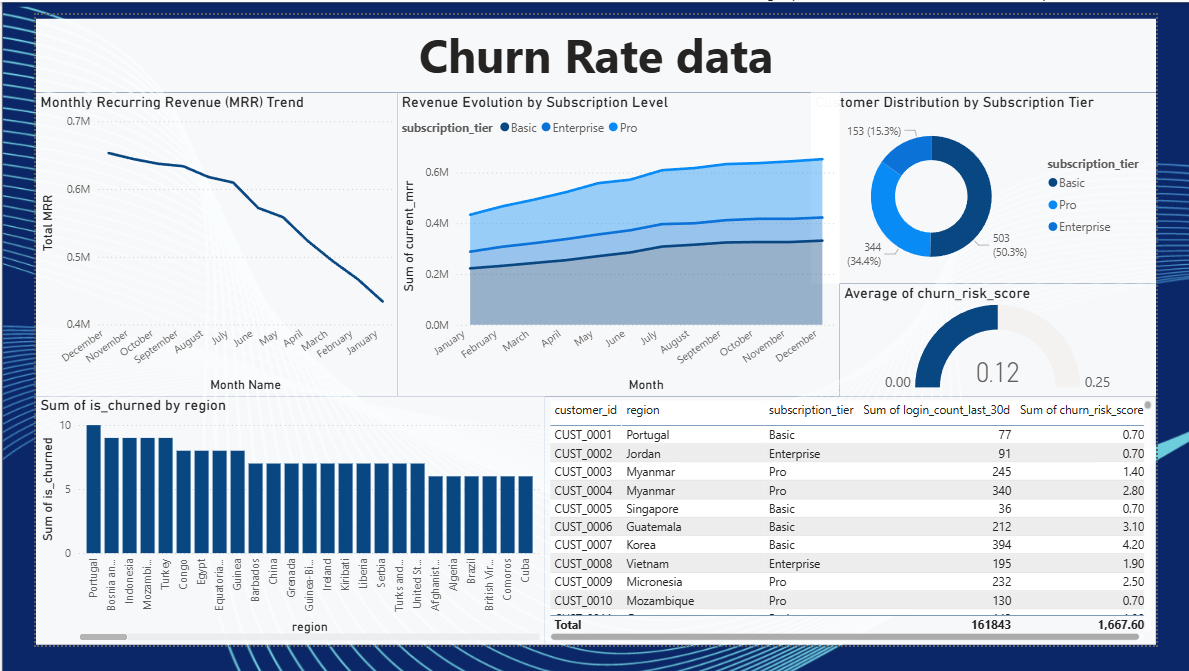
To build an interactive dashboard that models customer health, identifies users at risk of churning, and provides actionable insights to the Customer Success team to improve retention.
.
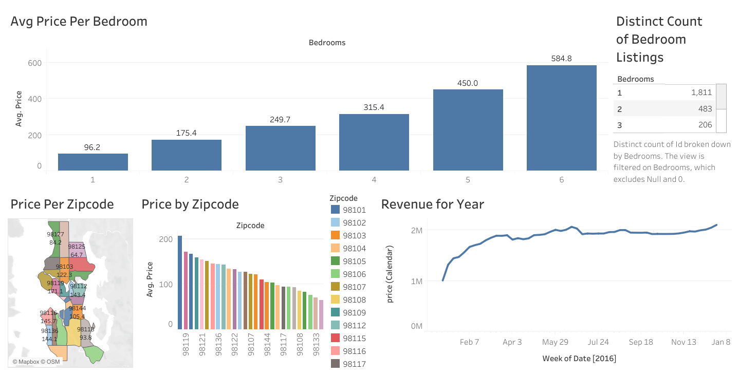
This dashboard explores housing price trends across Seattle zip codes, segmented by bedroom count and temporal revenue patterns. It was designed to help real estate stakeholders — from investors to urban planners — make data-driven decisions about pricing, inventory, and market timing.
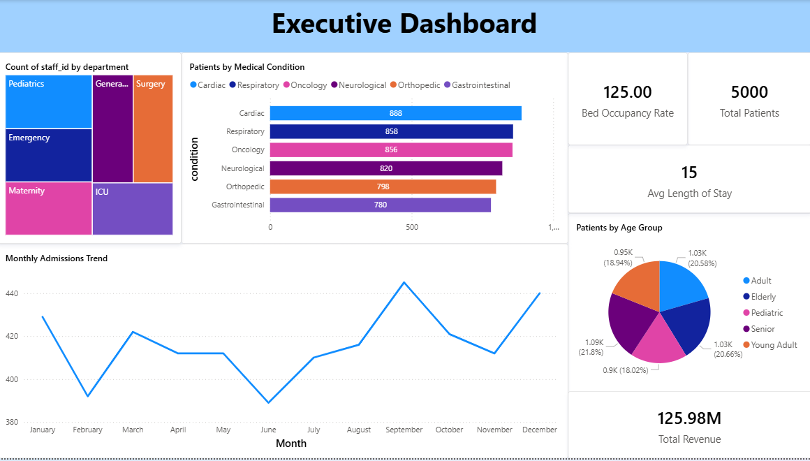
To analyze hospital operations, patient outcomes, and staff performance to identify areas for improvement in patient care and operational efficiency.
.

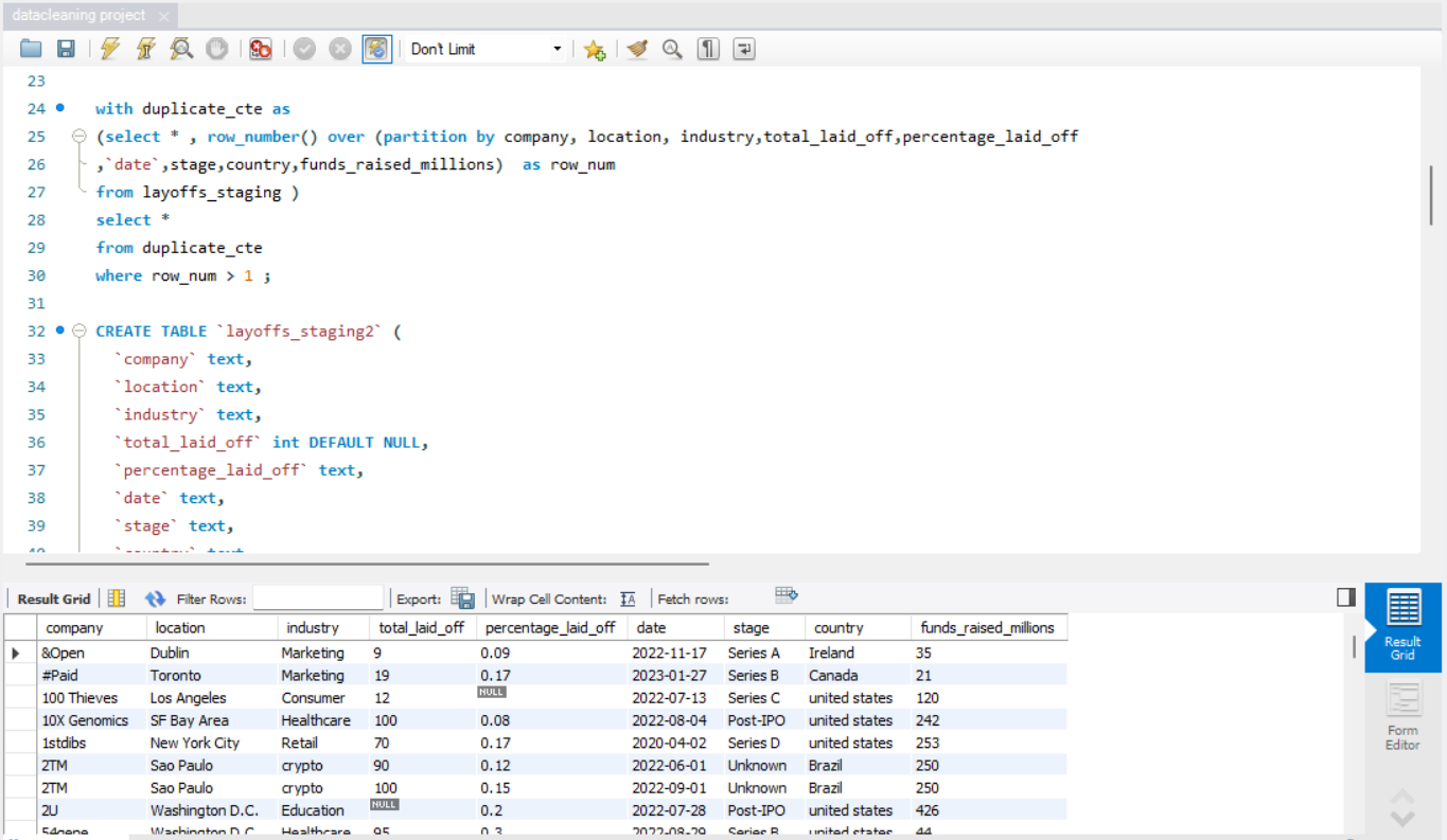
web scrapping a table from amazon website (api).